Coin of the Netherlands – United States of America, 400 years relationship

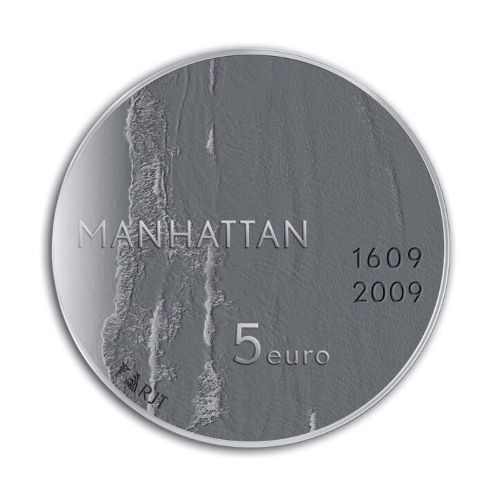
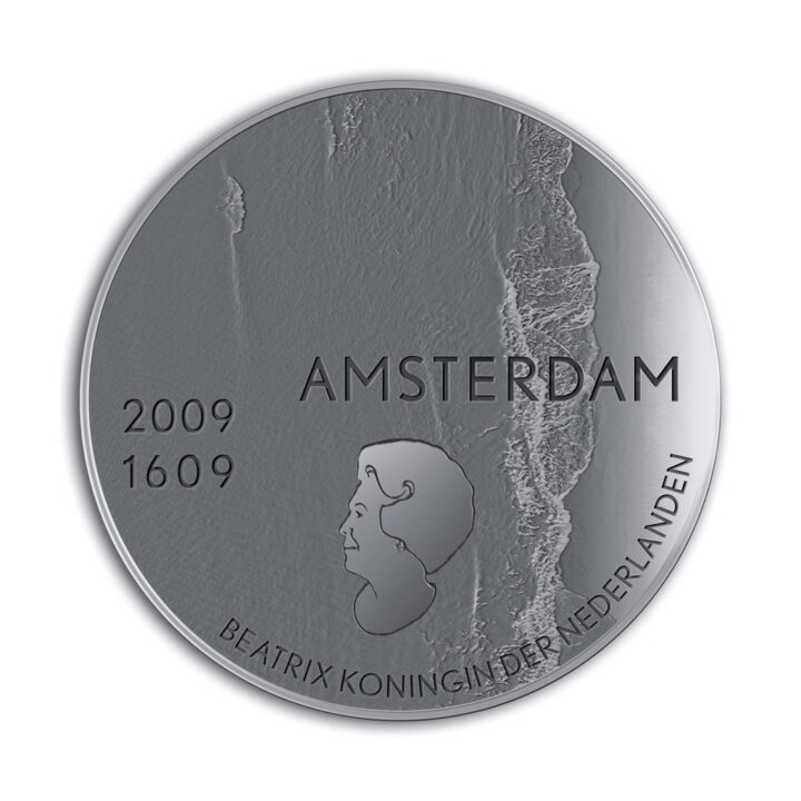
The main hallmark of 400 year old tie between Manhattan/New York and the Netherlands is of course the ocean, first separating the two continents while later becoming the primary link, especially in such a significant era like the past few centuries. This clear fact is the basis for the design.
My aim was to depict the water as physically as possible and I concluded in a very early stage that this had to be done in 3D relief, with the sea and foremost as an image and only in the second place as a representation.
Also, I expect that this surface will connect to the idea of the sea by its silver shine. The lower parts will have a dark shine, while the higher parts – for instance, the white crest – will have a matted white shine.
However, depending on how one holds the coin, this image may transform into its negative.
The cities
I decided to use the names of the cities and put them on the coin’s horizontal axis in exactly the same position on their respective sides. Both names contain nine letters.
I prefer the name Amsterdam over ‘the Netherlands’, as it recalls Manhattan’s earlier name of ‘Nieuw Amsterdam’. Besides, the word ‘Nederlanden’ is already on the coin and I didn’t want to double that.
The names of the cities begin or end near the edges of the coin, run into the sea and their positions correspond exactly. The name Amsterdam has been placed inside the coin. Amsterdam, the city on the old continent and also below sea level, has been sunk into the metal. The name Manhattan has been placed outwards, on top of the coin, rising above sea level. This gives the impression that Amsterdam’s imprint makes Manhattan stick out. The old city has elevated the new city.


